Men's Color Matching Guide: Build a Cohesive Wardrobe (2026)
Master the art of color coordination with this comprehensive guide to building a versatile, cohesive wardrobe that simplifies getting dressed every day.
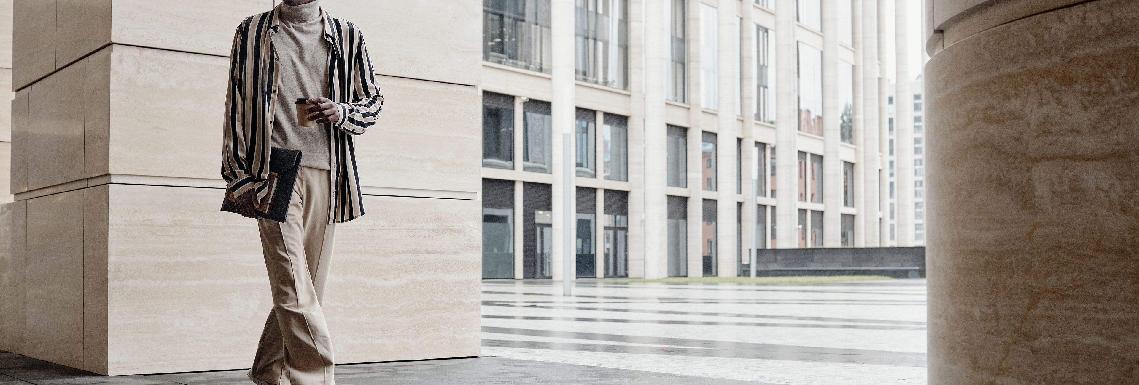
Why Color Is the Foundation of Every Outfit You Wear
Most guys buy clothes reactively. They see a shirt they like, they buy it, they get home and realize it matches nothing in their closet. Three months later they have a drawer full of orphaned garments that don't talk to each other. This is the color problem, and it's the reason so many men look like they're wearing borrowed clothes even when everything they own is new. Color matching isn't about having an eye for design. It's about understanding a few basic principles and applying them consistently. Once you get this right, getting dressed becomes automatic. Getting compliments becomes regular. Getting dressed for a wedding and realizing you own nothing that works becomes a thing of the past.
The guys who always look put together aren't buying better clothes. They're buying clothes that work together. Their navy blazer pairs with grey trousers and a white shirt. Their brown boots go with jeans, chinos, and tailored shorts. They have a system, and the system is built on color. You can replicate this. You just need to understand how to build a palette that functions as a unit rather than a collection of individual choices.
Color matching affects more than just aesthetics. Studies in visual perception consistently show that people form impressions within seconds of seeing someone, and color is one of the first things they process. A coherent outfit signals that you have your life together, that you pay attention to details, that you respect the context you're in. A mismatched outfit does the opposite. You don't need to be a fashion guy to understand this. You need to understand color theory at a practical level, and you need to commit to building a wardrobe that reflects it.
The Neutral Foundation: Colors That Never Stop Working
Every cohesive wardrobe starts with a neutral base. These are the colors that serve as your foundation, your canvas, your safety net. They are the colors you can always reach for because they pair with everything. If you build nothing else in your closet, build these first.
Navy is the single most versatile color a man can own. It is formal enough for business settings, casual enough for weekends, and interesting enough to anchor an outfit without overpowering it. Navy blazers work with grey trousers, khaki chinos, white jeans, and black jeans. Navy dress shirts work with grey suits, charcoal suits, and brown suits. Navy knitwear works under camel coats and over white t-shirts. If you buy one thing this month, make it a navy blazer or a navy top coat. The return on investment is unmatched.
Grey is the other anchor. Charcoal grey in particular is neutral without being as harsh as black, and it photographs well in all lighting conditions. A charcoal suit is more forgiving than a black suit. Grey wool trousers pair with navy, black, white, olive, burgundy, and camel. Grey crew neck sweaters work under blazers, over dress shirts, and alone with jeans. Build your grey collection across sweaters, trousers, and blazers before you worry about anything else.
White is non-negotiable. Not cream, not off-white, not ivory. Pure white. A white dress shirt elevates everything it touches. White t-shirts form the base layer for casual fits. White sneakers clean up better than any other shoe color. White linen trousers are the foundation of warm weather style. Without white in your wardrobe, you are leaving half your outfit combinations on the table.
Black has its place but needs to be used strategically. Black suits read as funereal in most contexts. Black t-shirts and black jeans are foundational for casual wear. Black boots and black belts serve as anchors. But black as the dominant color of an outfit is usually too severe for daytime and too common for evening. Use it as punctuation, not prose.
Tan and camel deserve special mention as the color that bridges warm and cool wardrobes. A camel overcoat makes navy and grey look expensive. Camel leather goods pair with navy and green better than brown does. Tan chinos work with white, blue, grey, navy, and olive. Tan is warm where grey is cool, and having both in your rotation gives you maximum flexibility.
Understanding Your Skin Tone: The Key to Every Color Decision
Color matching is not one-size-fits-all. The same shade of blue that looks excellent on one man will wash out another. The difference is skin tone, and understanding yours is the unlock that makes everything else click. Your skin tone falls into one of two categories: warm or cool. Within those categories, there are variations in depth, but the warm versus cool distinction is what matters most for wardrobe planning.
Cool skin tones have undertones of pink, red, or blue. The veins on the inside of your wrist appear blue or purple. Silver jewelry looks better on you than gold. In direct sunlight, your skin burns before it tans. If this sounds like you, your palette is built around cool colors: navy, burgundy, emerald, slate blue, forest green, and white. Avoid orange, mustard yellow, and warm earth tones, as they will make your skin look sallow and your complexion look tired.
Warm skin tones have undertones of yellow, peach, or golden. Your veins appear green. Gold jewelry looks better on you than silver. Your skin tans easily and rarely burns. If this sounds like you, your palette is built around warm colors: camel, olive, rust, mustard, burnt orange, and warm brown. Cool colors like grey, black, and white can still work for you, but they need to be the right shade. Warm grey rather than cool grey, off-white rather than stark white.
If you are still unsure which category you fall into, try this test. Take a plain white t-shirt and hold it against your face in a mirror. If your skin looks more alive and vibrant with the white against it, you are likely cool-toned. If the white makes your skin look yellow or dull, you are likely warm-toned. This is not scientific, but it is practical enough to get you moving in the right direction.
Once you know your tone, you can stop guessing. You stop buying colors that drain you and start buying colors that amplify you. This single adjustment is responsible for more improvement in men's wardrobes than any other factor. You do not need to overhaul your entire closet. You need to identify your best colors and build outward from them.
The Capsule Wardrobe Approach: Less Pieces, More Combinations
The capsule wardrobe is not a trend. It is a solution to the problem of having too much clothing that does not work together. The concept is simple: build a small collection of high-quality pieces that all pair with each other, so every combination is valid. For most men, a functional capsule wardrobe requires around 25 to 35 pieces. Some men go smaller. The exact number does not matter. What matters is that every piece you own can combine with at least three other pieces in your closet.
Start with bottoms. You need two pairs of trousers in neutral colors: one in charcoal grey and one in navy. Add two pairs of jeans: one in dark wash and one in light wash. These four bottoms serve as the foundation for virtually every outfit. From there, build your tops. You need three dress shirts: white, light blue, and a subtle pattern like a thin stripe or micro-check. Add three casual tops: a white t-shirt, a navy polo, and a grey crew neck sweater. This eight-piece core can generate dozens of combinations without repeating the same look.
Layering pieces complete the system. A navy blazer, a camel overcoat, and a charcoal cardigan add versatility without adding complexity. Each layer works with the base pieces. Your blazer works over your dress shirts, your t-shirts, and your sweaters. Your overcoat works over everything. Your cardigan works over shirts and t-shirts. When every piece connects to every other piece, getting dressed stops being a decision and becomes a process.
The capsule approach also forces discipline. When you know exactly what colors you own, you stop buying impulse pieces that do not fit the system. You stop purchasing that teal shirt that looked good on the mannequin but sits in your drawer because nothing else is the right shade of teal. You buy with intention, and intention is what separates a curated wardrobe from a cluttered one.
Color Proportion and the Art of the Visual Ratio
Knowing which colors to wear is only half the equation. Knowing how much of each color to use is the other half. Color proportion is what separates a well-considered outfit from a random collection of pieces. The principle is straightforward: one color should dominate, one should support, and one should accent. If three colors are all competing for attention, none of them wins.
The dominant color is typically your bottoms or your outer layer. Navy trousers or grey trousers will dominate most outfits simply because they cover the most surface area. The supporting color is usually your shirt or your top layer. White, light blue, or a complementary shade of grey. The accent color is the smallest visible element: a belt, a watch, a pocket square, or a pair of shoes. Accents are where personality lives, but they only work if the foundation is solid.
Monochromatic dressing, which means wearing variations of a single color, is the easiest way to look intentional without overthinking. A charcoal suit with a light grey shirt and a charcoal tie is monochromatic at its finest. Navy trousers with a navy blazer and a white shirt is monochromatic in a more casual register. This approach requires fewer decisions and produces more reliable results. If you are unsure about a combination, lean toward monochromatic and you will rarely be wrong.
When you introduce a second color, make sure the relationship between them is strong. Complementary colors, which sit opposite each other on the color wheel, create visual interest but require careful calibration. Blue and orange work together but can overwhelm if both are saturated. Analogous colors, which sit next to each other on the color wheel, create harmony and are safer to execute. Navy and olive are analogous and always work. Burgundy and navy are analogous and always work. Understanding this relationship allows you to take risks without making mistakes.
Building Your Color System for 2026 and Beyond
Color matching is not a one-time fix. It is an ongoing commitment to intentional purchasing. Every time you consider buying a new piece, you ask one question: does this fit my color system? If the answer is yes, you buy it. If the answer is no, you pass. This simple filter prevents closet creep, the condition where your wardrobe grows but your outfit options do not.
As you build, think in terms of thirds. One third of your wardrobe should be neutrals: navy, grey, black, white, camel, tan. One third should be your core colors, which are the shades that look best on you based on your skin tone. The remaining third is your accent budget, where you allow yourself one or two seasonal colors or trend pieces that rotate in and out. This distribution keeps your wardrobe functional while allowing for expression.
Seasonal variations matter. In spring and summer, lighter shades of your core colors perform better. Light blue instead of navy. Stone instead of charcoal. White t-shirts instead of grey ones. In fall and winter, you shift back toward deeper versions of your palette. The structure stays the same. The specific hues change based on the context of the season. When you understand this, getting dressed becomes a matter of rotation rather than reinvention.
The goal is a wardrobe where getting dressed takes under five minutes because every possible combination is a good one. That happens when your color system is solid. You reach for pieces that work together. You get dressed with confidence. You leave the house looking like someone who has their act together, because you do. Color is the foundation. Everything else sits on top of it.